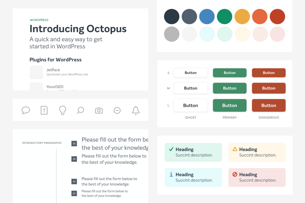
Coral is a design system developed to bring clarity, beauty and coherence across Namecheap’s WordPress hosting products.
The system started in 2018. It is an evolving, iterative and collaborative effort done together with engineering.
After we released the MVP of EasyWP, we wanted to optimize our delivery speed of new features, improve our collaboration and refine our brand identity.
We started by auditing all our existing patterns and user interface components. We clarified our design principles, polished our brand and worked towards a flexible and accessible UI system.
Design Principles
Clarity
- Enable people to act with confidence. Not anxious or frustrated.
- Be honest and clear. Don’t be overwhelming or deceiving. Go to the point. No bullshit.
- Design primarily to be functional, usable and useful.
Flexible
- Be consistent but not too rigid. Allow interfaces to adapt to user’s needs and perceptions.
- Give power to the user while being focused and intentional. Don’t be overwhelming.
Beauty
- Delight and provide beautiful interactions. Not at the expense of efficiency.
- Design for users perception of the product through timeless solutions.
- Make the experience lively and inspirational without distractions.
Universal
- Design to be inclusive and accessible without being impersonal.
- Use depth and contrast for optimal affordances.
- Educate to help users succeed.
Coherence
- Make the whole product harmonious. Everything should work together towards the same meaning.
- Design a beautiful, singular experience throughout.
Typography
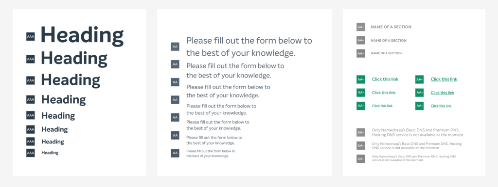
The first building block for EasyWP covers 90% of the interface: typography. For this design system, the focus was on defining a versatile tool for both developers and designers. At the same time, we made improvements on clarity, readability and coherence for customers.
For the design system, we continued to use Intelo. This typeface had already proved to have the right balance of character and efficiency.
Intelo was created with the single idea of redefining what makes a functional grotesque typeface nowadays. Its large x-height and letterforms with subtle elliptical finish create a distinctive look that can help brands cater to an increasingly design savvy audience. (…)
To sum it up, the friendly and inviting letterforms of Intelo came as a solution to the need for more human fonts in our technology-oriented environment.
Kastelov

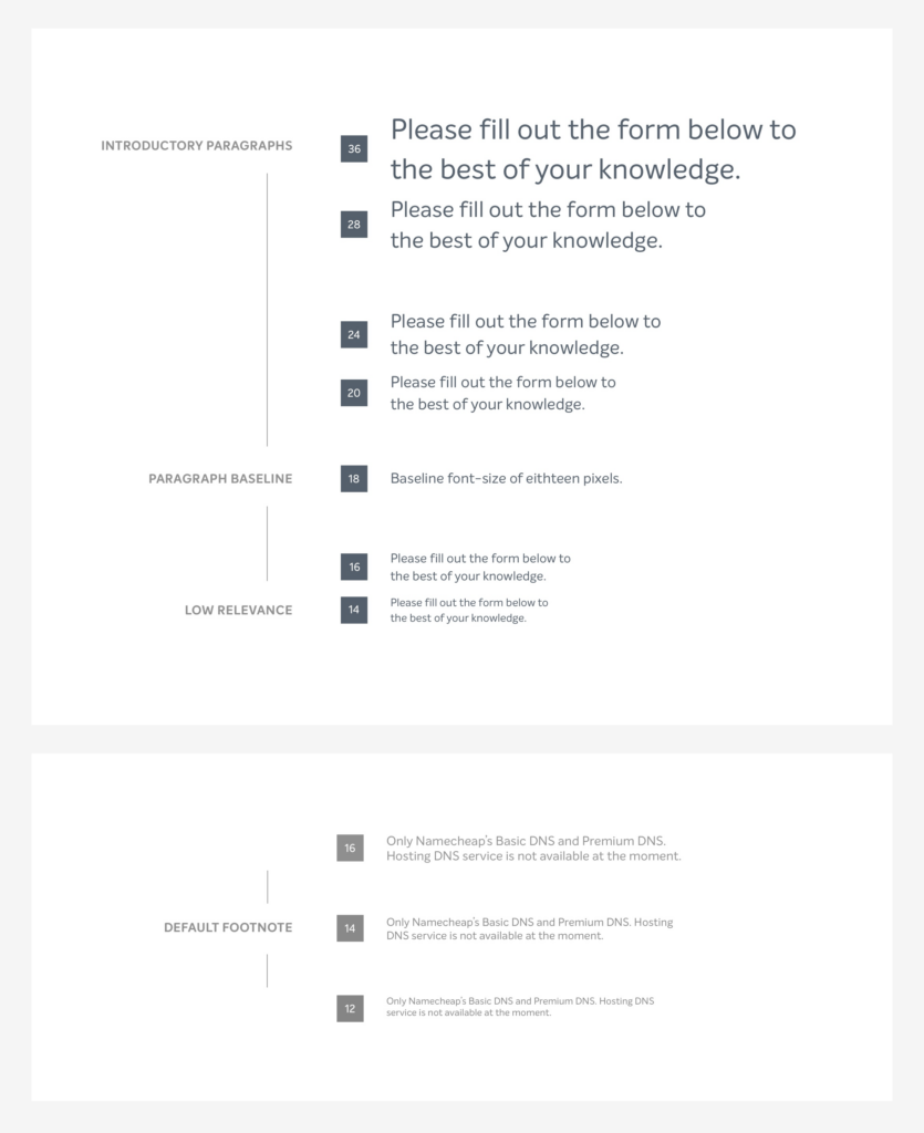
The system includes guidelines for designers to achieve a clear hierarchy and nicely balanced type setting. We also defined baseline sizes that are set as defaults in CSS.
Colors
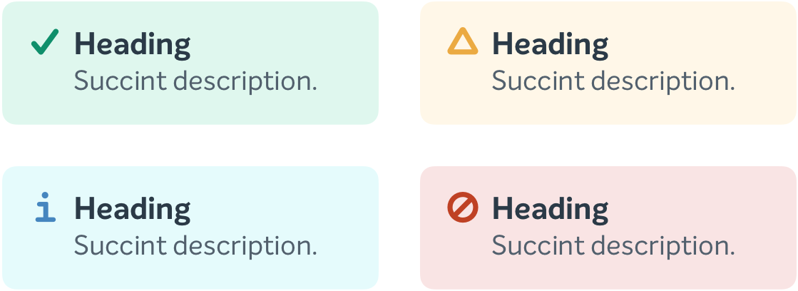
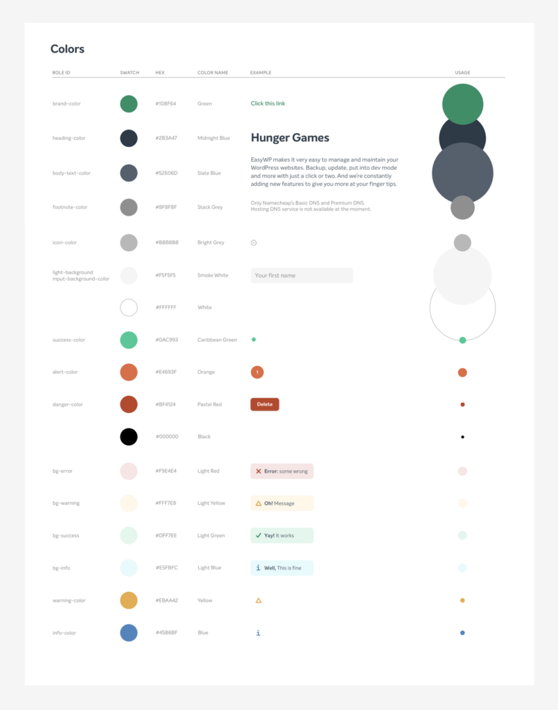
Most of the interface is bright and light. Colour is used for specific accents and to communicate different meanings inside EasyWP dashboard.
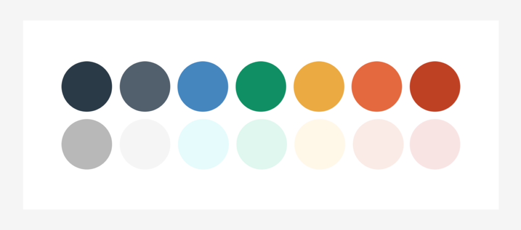
The goal was to have a palette that could convey the playful character of the brand in marketing contexts and used in the product with great legibility and contrast.

For each colour we defined roles classes in the system, so that their purpose and usage is clear also for developers.
Buttons
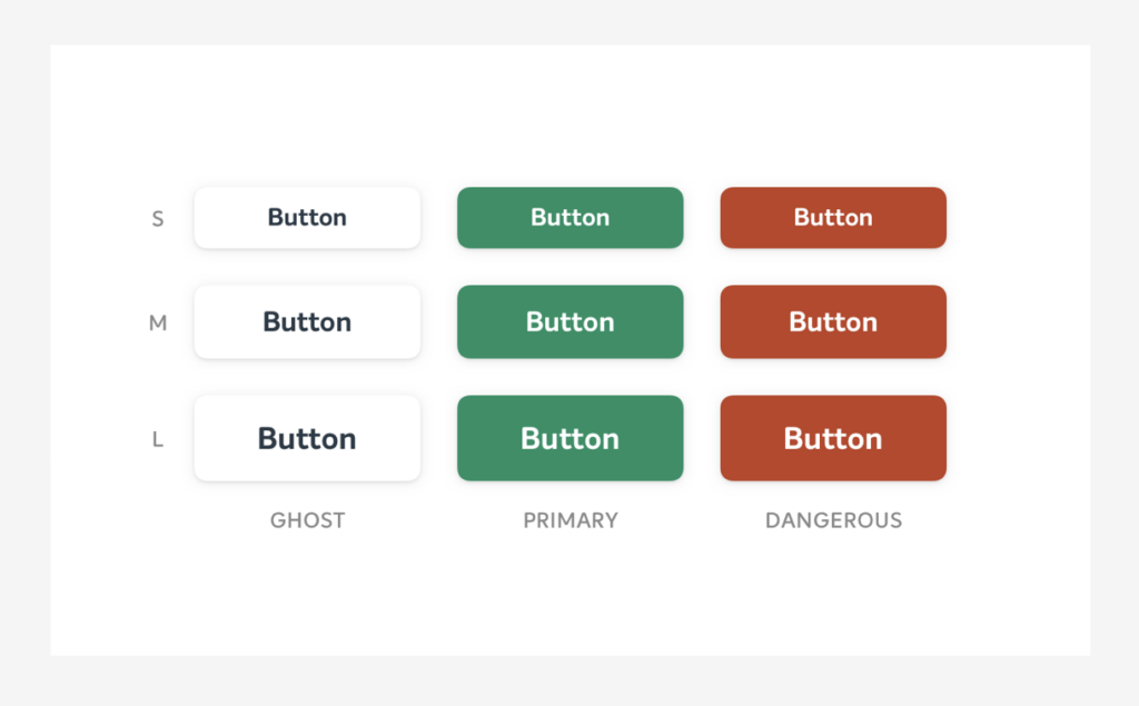
For buttons we introduced three variants in three different sizes:
- Ghost: this is the default button for the app. It iterates on the previous version of white background and dark text.
It’s the most used style. - Primary: uses the brand colour and signals significant actions. To be used with intention.
- Dangerous: the most attention grabbing button was created mainly for irreversible, delicate or dangerous actions. To be used cautiously.
For each variant, we also defined hover, active and disabled states.
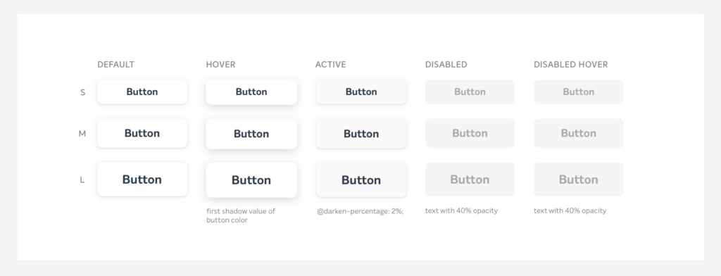
When hovered, the buttons appear to subtly raise as if they are brought closer to the screen. It was important that the hover effect didn’t affect the elements surrounding the buttons. We could use a different border width to achieve the effect, but this would mean the button would jump and shift things and require us to use negative margins. So: borders were avoided on all buttons and states. To achieve this effect we use a double shadow.

Grid and Spacings
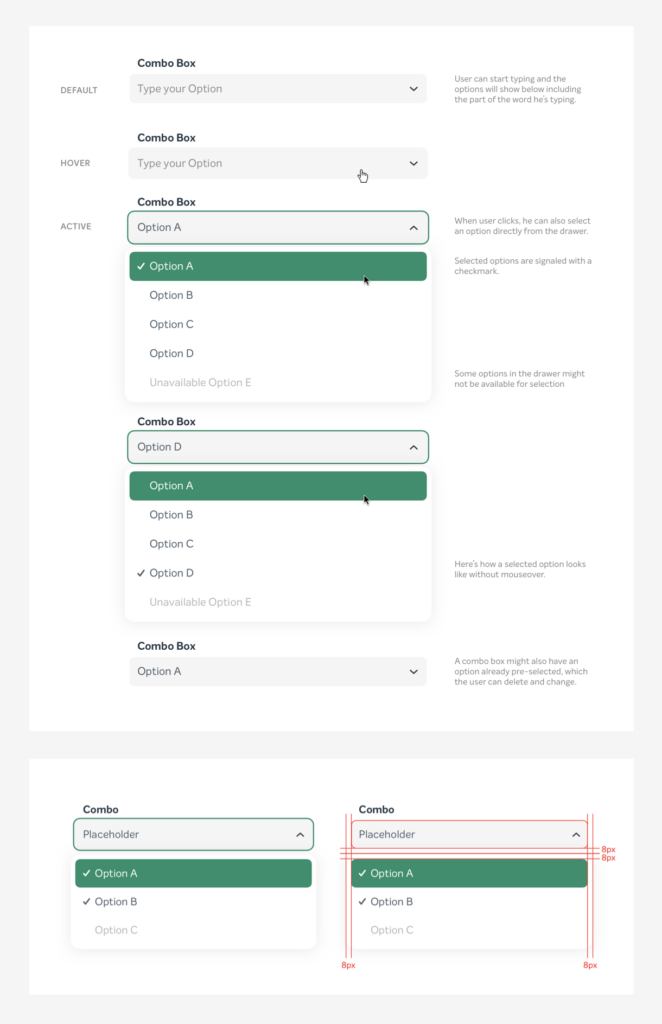
For EasyWP we use a soft-grid approach based on coherent spacings and flexible components. We’re using multiples of 8 to generate margin and padding values, card sizes, round corners, shadow effects, etc. This guides our interface to feel more harmonious and structured and helps in our internal communication.
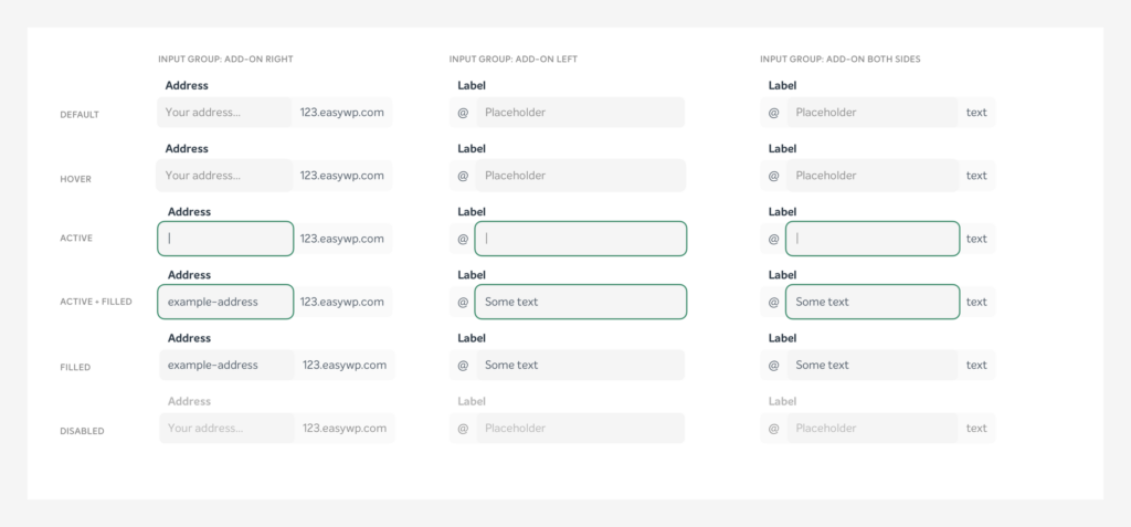
Even though this is the rule, occasionally we might need to break the grid to achieve the right optical balance. This is the case, for instance, on inputs, where the padding on the sides had to be adjusted so that inputs can feel right and work on smaller screen sizes.
Forms
For the design of the inputs, we sought to keep the same fluid and light interface from other elements for a cohesive and consistent feeling. We also wanted to make its multiple states clear and clearly identifiable.
All inputs have an always visible label to communicate the exact purpose of the field in all states. Placeholders within the field are used to provide examples of the kind of information the user should provide. Hovering the inputs with the mouse suggests interactivity by subtly increasing the size of the input. When the users selects a field, either with mouse or keyboard tab, the field is clearly selected. This gives the user a precise sense of location within any form.
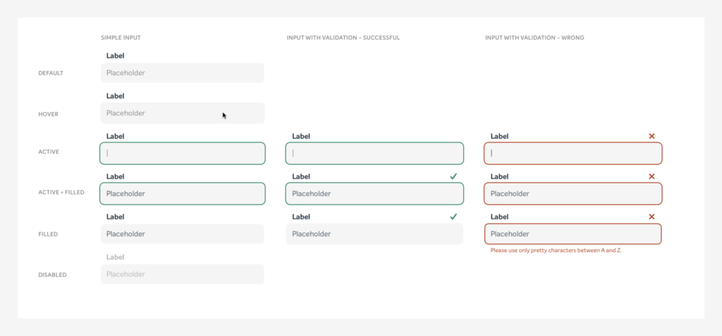
In usability testing, it was determined that the cross icon resembled too much like a close button. We later decided to change this icon to an exclamation point.
Toggles, Checkboxes and Radio Buttons
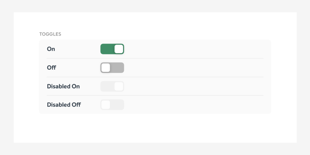
Interactive components were designed following the soft grid and brand identity. It was important that each component’s state were unambiguous.
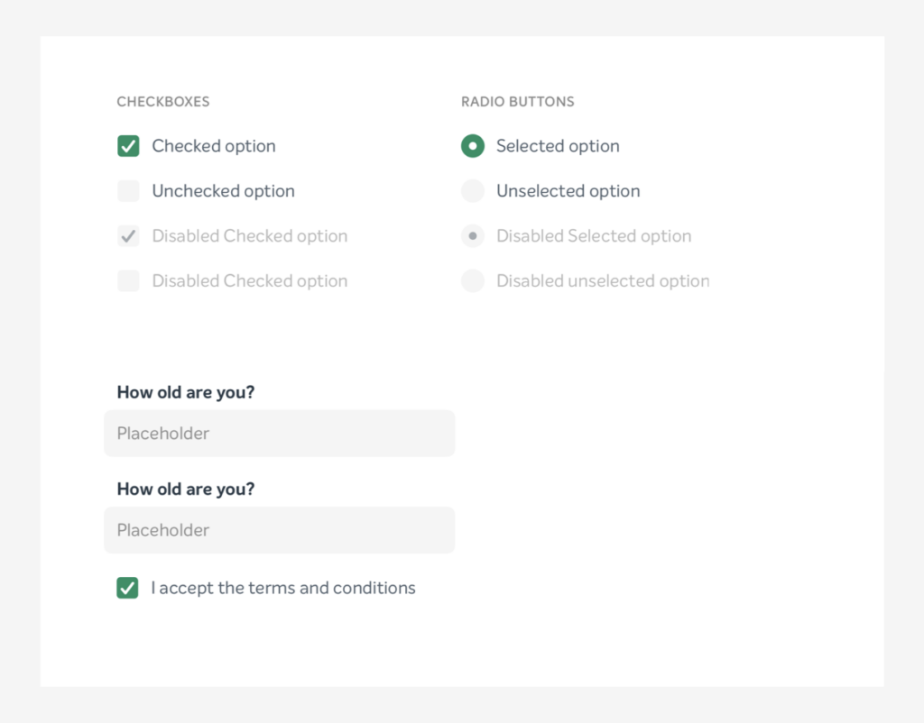

Illustration and Motion System
Together with a communication designer, an illustrator and animators, we designed an illustration system to support our communication. As lead on the team I provided creative direction.

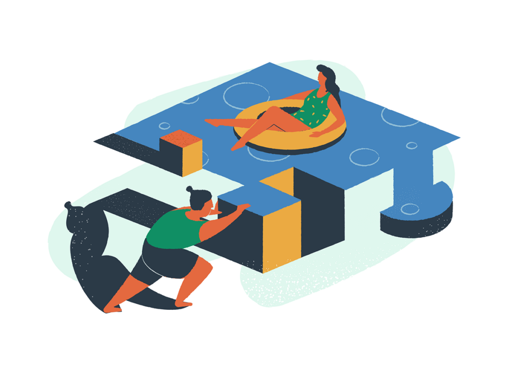
The new illustration system was designed to be flexible and expressive in our marketing materials. This made EasyWP recognisable and distinct from other WordPress Hosting brands.
It was important to create illustrations that were captivating, that communicate ideas of playfulness and ease of use. We feature familiar and diverse characters that tell the story of building, of collaboration and fulfilment.
We developed a template system that enabled us to quickly put together a graphic or visual for social media, newsletters and other needs, while keeping things coherent and beautiful.
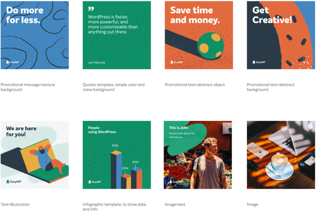
Illustration is used inside the product in onboarding flows and growth actions like Refer a Friend.

In animation, we also defined key loops that can be easily reused in different videos like intros, outros, walking cycles and others.